Image Carousels Don’t Convert
I thought of titling this “Image Carousels Are Evil,” but that sounded too melodramatic. But think back to your school days. Ever been reading a book and have some kid shut it on you or swipe the pages so you lose your place? That’s what reading carousel content feels like to me. Only they keep doing it. And it’s their book, which they spent a lot of time writing, and then asked me to read it. It just doesn’t make any sense. Why bully your customers?
I’m not the only one who feels this way. Jared Smith built ShouldIUseACarousel? to bring attention to this issue. It is an entertaining, educational look at why they don’t work. Jared’s initial issue is accessibility, which is clearly important, but there is also the conversion and effectiveness issue.
I’m going to blatantly steal a couple of his references because you might miss them (hey, they’re in a carousel) and they’re important.
Erik Runyon shows that everyone clicks on the first image. If you picked a carousel because you believe all of its content is equally important, you’re not treating them equally unless the carousel is randomized for each visit.
Jakob Nielsen, usability consultant to the stars, writes how the user fails at their task when presented with a carousel. Usability is so insanely important in ecommerce because it tests whether the customer can buy something from you. That’s the whole point of your site!
In talking with clients and ecommerce folks, it’s clear at this point that people want carousels (AKA image sliders) because other sites use them. It’s trading on social proof. But carousels started because these popular sites designed by committee, beholden to politics and hostage to infighting between multiple stakeholders who all demand their content be “above the fold.” That’s not you. And in fact, it’s no longer them, either. The big sites got smart and now have conversion optimizers on staff who can prove carousels don’t work. They will make my point for me.
Back in the Web 1.0 days, the aforementioned Jakob Nielsen gave some great advice: copy Yahoo and Amazon. By this, he meant you should follow the practices set by the companies who are teaching people what to expect on the web. That lesson still applies.
I don’t know if Amazon is still a good example to follow, as they are so big they can break rules or make new ones. They even force me to make the distinction that I’m really rallying against auto-forwarding, because they have two carousels on their home page and neither auto-forward. Carousels that are entirely under user control are fine, but visitors are unlikely to see content other than the default.
Other than Amazon, there are plenty of billion dollar companies with crack optimization teams. Macy’s has a tiny rotating image at the top that you can safely ignore; the rest is composed of static content areas. Nordstrom and Target are all static content. Anthropologie has some sparkly decorative animation, but it’s mostly an image map.
All of those companies realize that above the fold isn’t important anymore. You’re going to scroll down. Part of this is because most home page views are direct visits – you typed the URL into your browser, so they’re not worried about bouncing like they would with a landing page from an ad or search result link.
The lesson, like always, is to hypothesize what content will have the biggest impact on profit, then test it against other options and measure the results. When you realize that’s your mission, you drop the carousel quickly because they are too hard to test.
If someone has put a gun to your head and forced you to use a carousel, please use one that does the following:
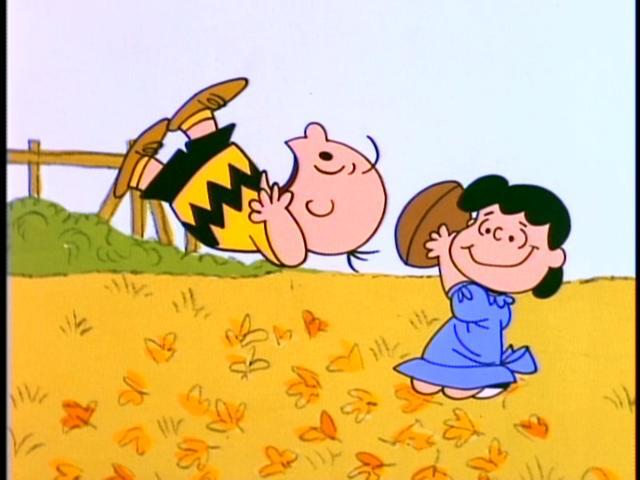
- Automatically pauses on hover. Mouse pointer movement correlates highly with eye tracking, so the pointer on the image means they are reading it, or – crazy thought – are getting ready to click. Don’t yank it away like Lucy with a football.
- Stop rotating content the moment a carousel navigation button – side or bottom – is clicked. Same reason as above.
But really, just stop. In fact, remove any animation or movement from a page you want me to read. As Jared Smith says, it’s the blink tag all over again.